Laws of UX
Laws of UX is a collection of best practices that designers can consider when building user interfaces.
1. Aesthetic-Usability Effect
Users often perceive aesthetically pleasing design as design that’s more usable.
- An aesthetically pleasing design creates a positive response in people’s brains and leads them to believe the design actually works better.
- People are more tolerant of minor usability issues when the design of a product or service is aesthetically pleasing.
- Visually pleasing design can mask usability problems and prevent issues from being discovered during usability testing.

|

|
2. Doherty Threshold
Productivity soars when a computer and its users interact at a pace (<400ms) that ensures that neither has to wait on the other.
Provide system feedback within 400 ms in order to keep users’ attention and increase productivity.
- Use perceived performance to improve response time and reduce the perception of waiting.
- Animation is one way to visually engage people while loading or processing is happening in the background.
- Progress bars help make wait times tolerable, regardless of their accuracy.
- Purposefully adding a delay to a process can actually increase its perceived value and instill a sense of trust, even when the process itself actually takes much less time.

|

|
3. Fitts’s Law
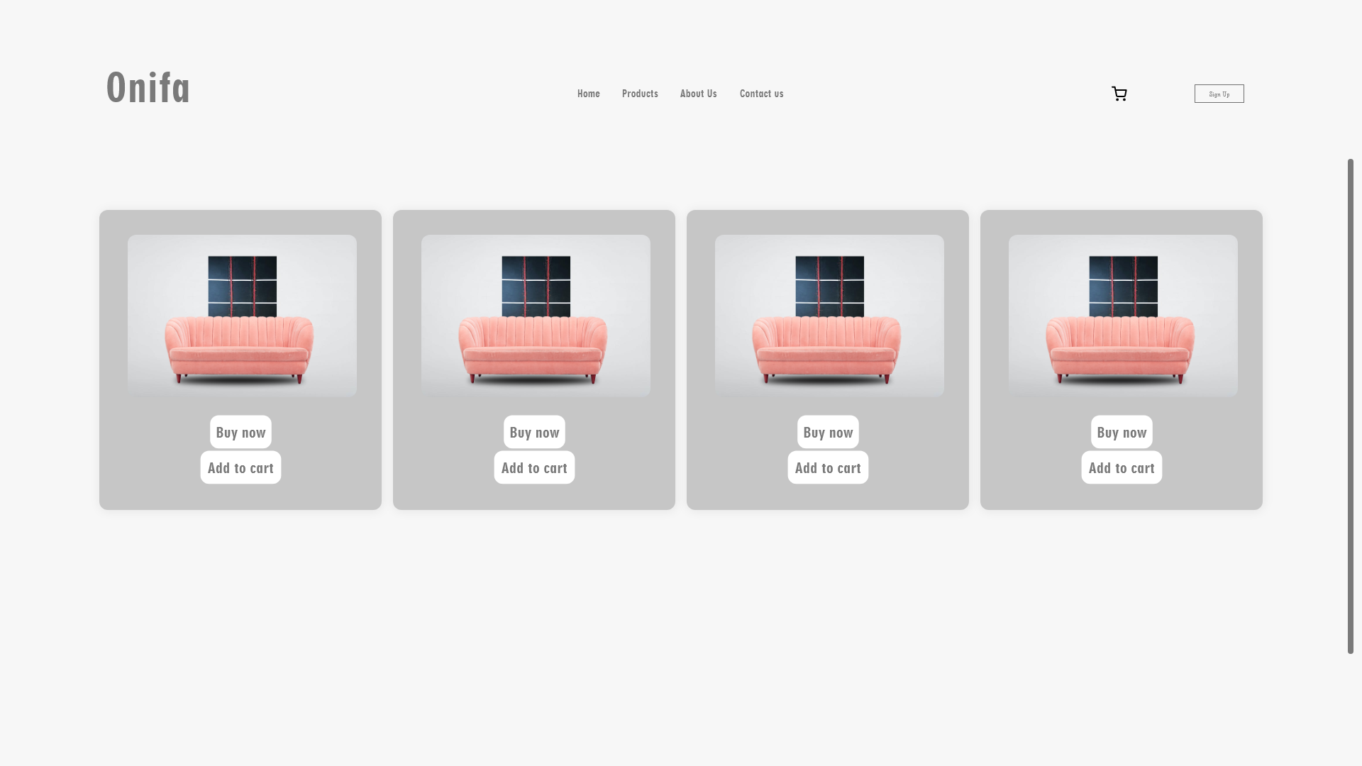
The time to acquire a target is a function of the distance to and size of the target.
- Touch targets should be large enough for users to accurately select them.
- Touch targets should have ample spacing between them.
- Touch targets should be placed in areas of an interface that allow them to be easily acquired.

|
|
4. Goal-Gradient Effect
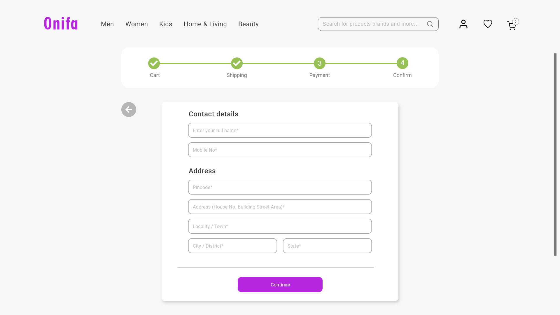
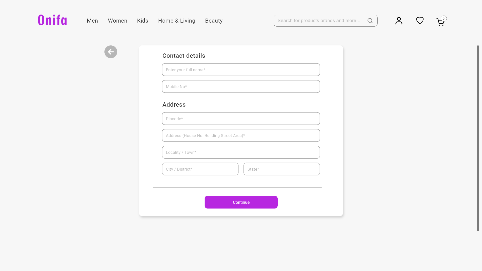
The tendency to approach a goal increases with proximity to the goal.
- The closer users are to completing a task, the faster they work towards reaching it.
- Providing artificial progress towards a goal will help to ensure users are more likely to have the motivation to complete that task.
- Provide a clear indication of progress in order to motivate users to complete tasks.
|
|
5. Hick’s Law
The time it takes to make a decision increases with the number and complexity of choices.
- Minimize choices when response times are critical to increase decision time.
- Break complex tasks into smaller steps in order to decrease cognitive load.
- Avoid overwhelming users by highlighting recommended options.
- Use progressive onboarding to minimize cognitive load for new users.
- Be careful not to simplify to the point of abstraction.

|

|
6. Jakob’s Law
Users spend most of their time on other sites. This means that users prefer your site to work the same way as all the other sites they already know.
- Users will transfer expectations they have built around one familiar product to another that appears similar.
- By leveraging existing mental models, we can create superior user experiences in which the users can focus on their tasks rather than on learning new models.
- When making changes, minimize discord by empowering users to continue using a familiar version for a limited time.

|

|
7. Law of Common Region
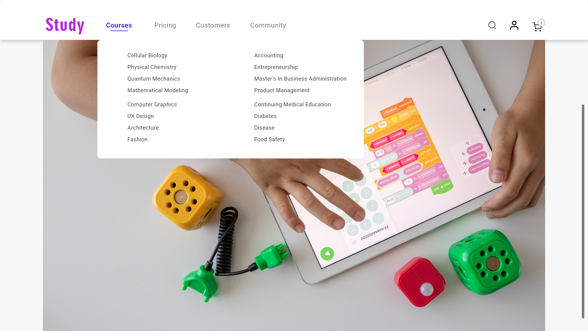
Elements tend to be perceived into groups if they are sharing an area with a clearly defined boundary.
- Common region creates a clear structure and helps users quickly and effectively understand the relationship between elements and sections.
- Adding a border around an element or group of elements is an easy way to create common region.
- Common region can also be created by defining a background behind an element or group of elements.

|
|
8. Law of Proximity
Objects that are near, or proximate to each other, tend to be grouped together.
- Proximity helps to establish a relationship with nearby objects.
- Elements in close proximity are perceived to share similar functionality or traits.
- Proximity helps users understand and organize information faster and more efficiently.

|

|
9. Law of Prägnanz
People will perceive and interpret ambiguous or complex images as the simplest form possible, because it is the interpretation that requires the least cognitive effort of us.
- The human eye likes to find simplicity and order in complex shapes because it prevents us from becoming overwhelmed with information.
- Research confirms that people are better able to visually process and remember simple figures than complex figures.
- The human eye simplifies complex shapes by transforming them into a single, unified shape.

|

|
10. Law of Similarity
The human eye tends to perceive similar elements in a design as a complete picture, shape, or group, even if those elements are separated.
- Elements that are visually similar will be perceived as related.
- Color, shape, and size, orientation and movement can signal that elements belong to the same group and likely share a common meaning or functionality.
- Ensure that links and navigation systems are visually differentiated from normal text elements.

|

|
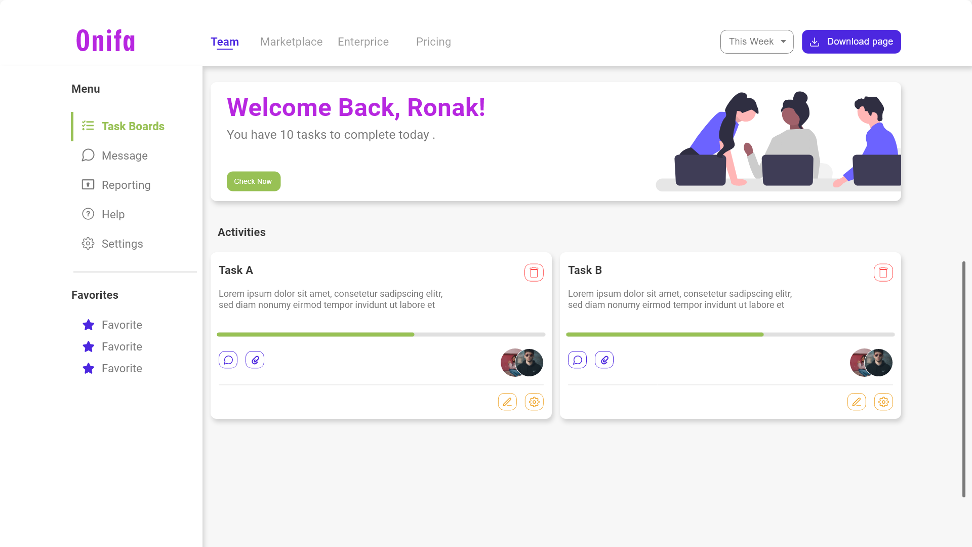
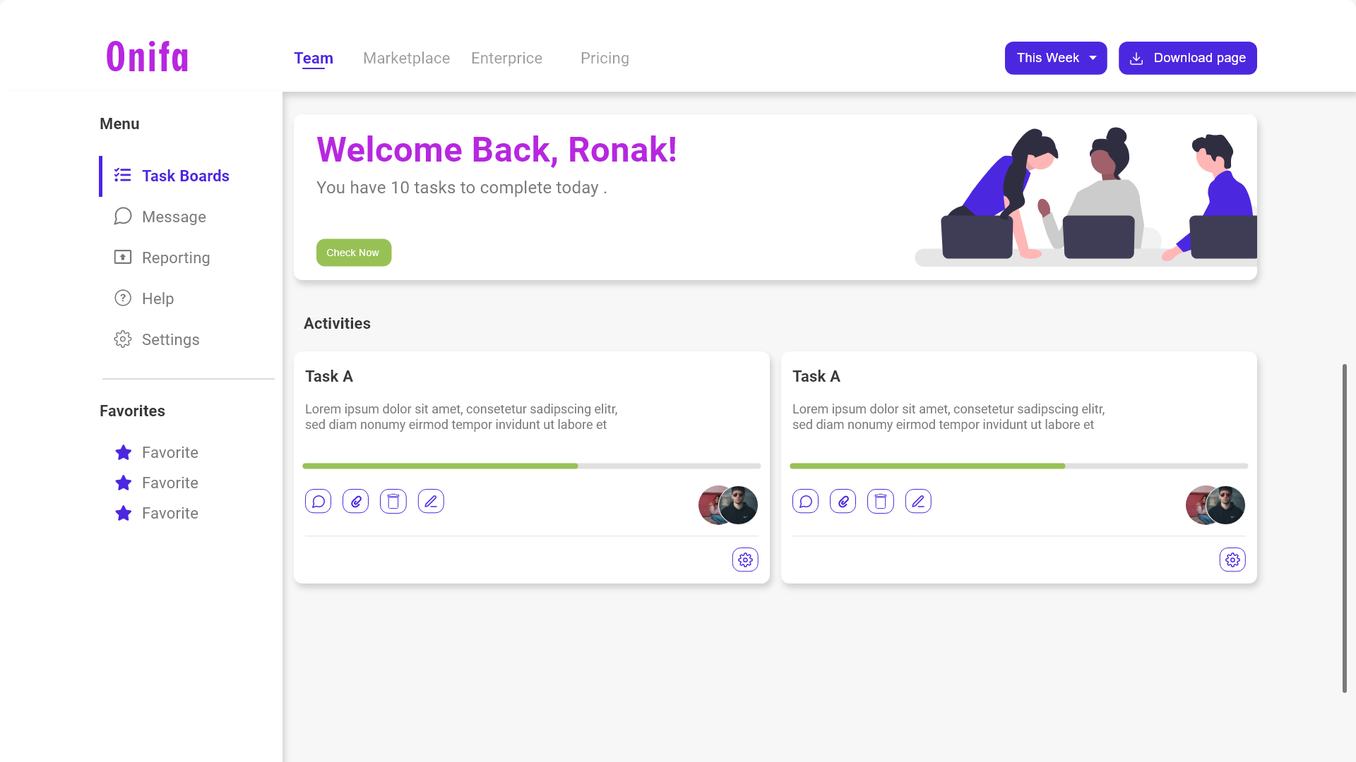
11. Law of Uniform Connectedness
Elements that are visually connected are perceived as more related than elements with no connection.
- Group functions of a similar nature so they are visually connected via colors, lines, frames, or other shapes.
- Alternately, you can use a tangible connecting reference (line, arrow, etc) from one element to the next to also create a visual connection.
- Use uniform connectedness to show context or to emphasize the relationship between similar items.
|
|
12. Miller’s Law
The average person can only keep 7 (plus or minus 2) items in their working memory.
- Don’t use the “magical number seven” to justify unnecessary design limitations.
- Organize content into smaller chunks to help users process, understand, and memorize easily.
- Remember that short-term memory capacity will vary per individual, based on their prior knowledge and situational context.

|

|
13. Occam’s Razor
Among competing hypotheses that predict equally well, the one with the fewest assumptions should be selected.
- The best method for reducing complexity is to avoid it in the first place.
- Analyze each element and remove as many as possible, without compromising the overall function.
- Consider completion only when no additional items can be removed.

|

|
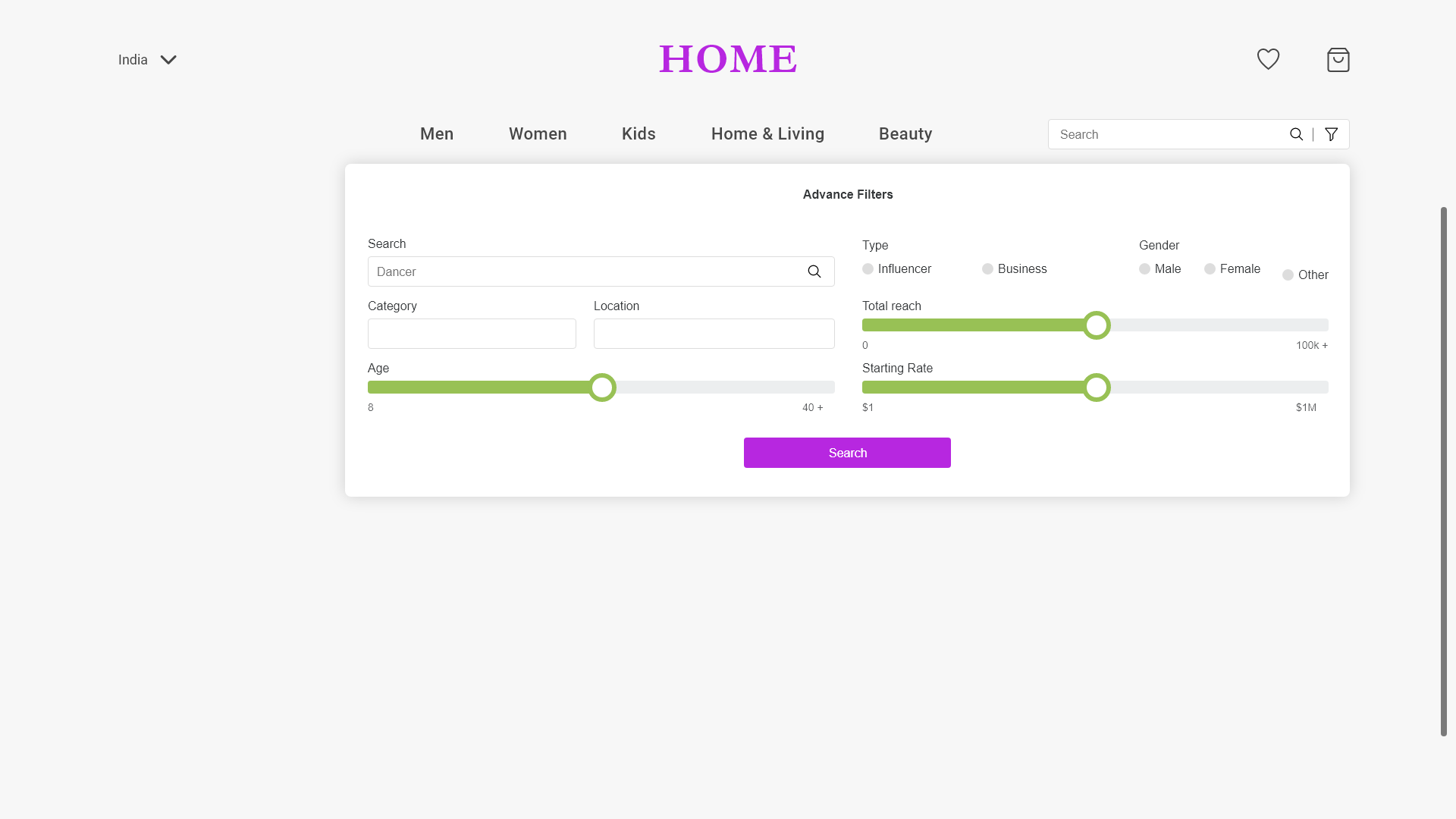
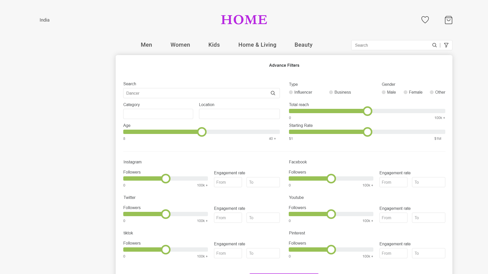
14. Pareto Principle
The Pareto principle states that, for many events, roughly 80% of the effects come from 20% of the causes.
- Inputs and outputs are often not evenly distributed.
- A large group may contain only a few meaningful contributors to the desired outcome.
- Focus the majority of effort on the areas that will bring the largest benefits to the most users.
|
|
15. Parkinson’s Laws
Any task will inflate until all of the available time is spent.
- Limit the time it takes to complete a task to what users expect it’ll take.
- Reducing the actual duration to complete a task from the expected duration will improve the overall user experience.

|

|
16. Peak-End Rule
People judge an experience largely based on how they felt at its peak and at its end, rather than the total sum or average of every moment of the experience.
- Pay close attention to the most intense points and the final moments (the “end”) of the user journey.
- Identify the moments when your product is most helpful, valuable, or entertaining and design to delight the end user.
- Remember that people recall negative experiences more vividly than positive ones.

|

|
17. Postel’s Law
Be liberal in what you accept, and conservative in what you send.
- Be empathetic to, flexible about, and tolerant of any of the various actions the user could take or any input they might provide.
- Anticipate virtually anything in terms of input, access, and capability while providing a reliable and accessible interface
- The more we can anticipate and plan for in design, the more resilient the design will be.
- Accept variable input from users, translating that input to meet your requirements, defining boundaries for input, and providing clear feedback to the user.

|

|
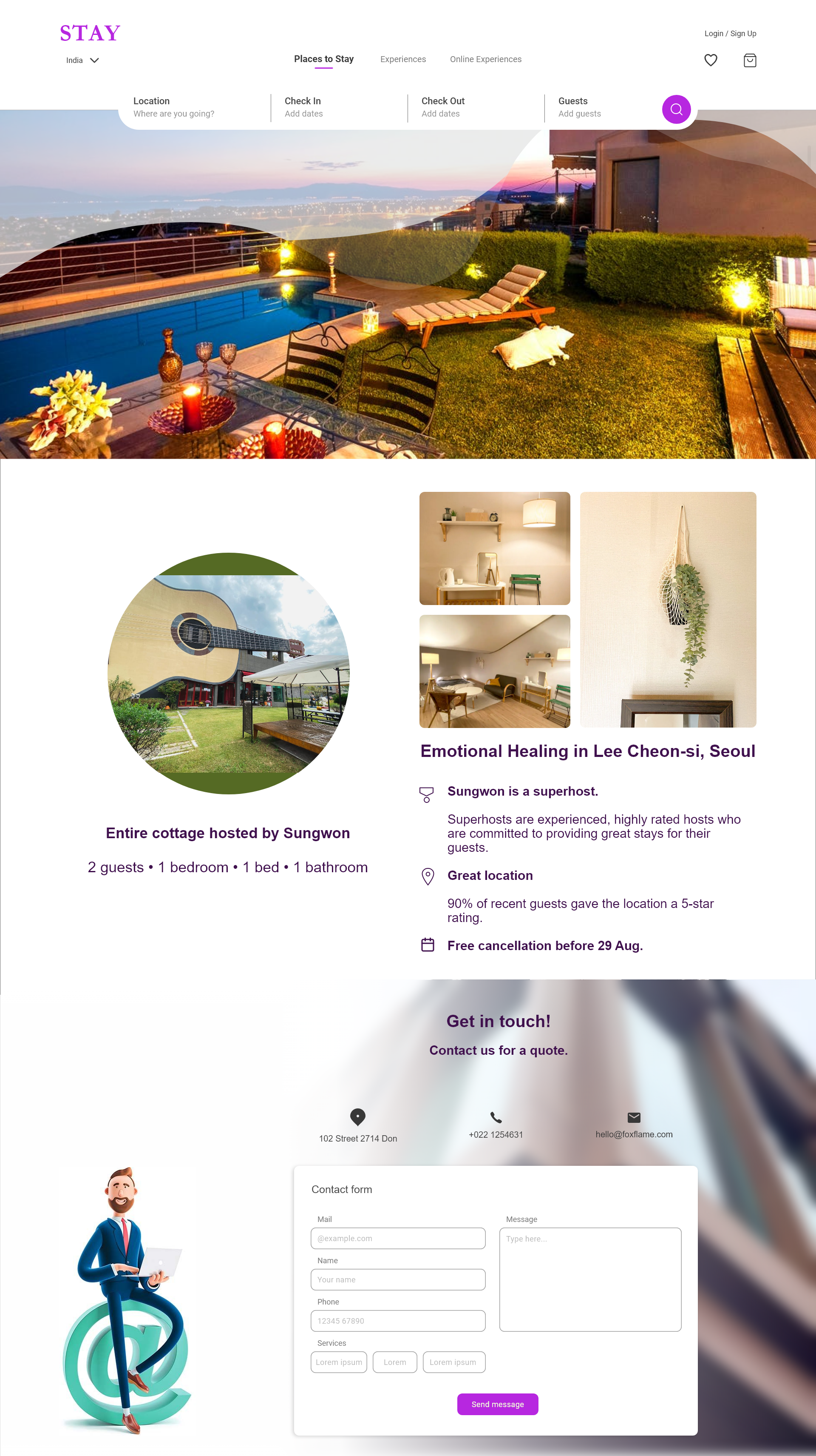
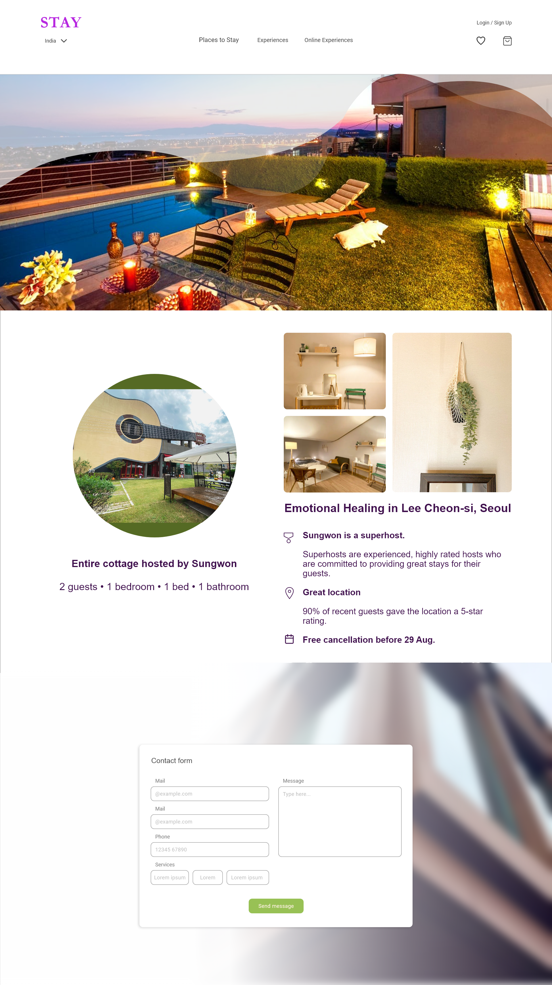
18. Serial Position Effect
Users have a propensity to best remember the first and last items in a series.
- Placing the least important items in the middle of lists can be helpful because these items tend to be stored less frequently in long-term and working memory.
- Positioning key actions on the far left and right within elements such as navigation can increase memorization.
|
|
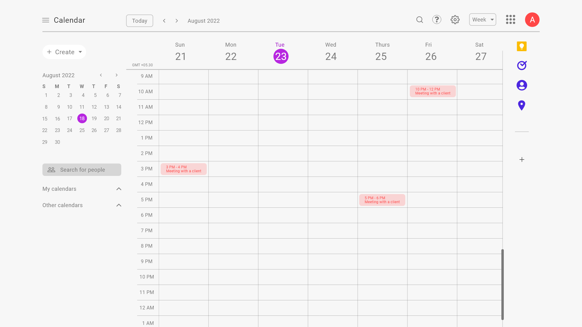
19. Tesler’s Law
Tesler’s Law, also known as The Law of Conservation of Complexity, states that for any system there is a certain amount of complexity which cannot be reduced.
- All processes have a core of complexity that cannot be designed away and therefore must be assumed by either the system or the user.
- Ensure as much as possible of the burden is lifted from users by dealing with inherent complexity during design and development.
- Take care not to simplify interfaces to the point of abstraction.
|
20. Von Restorff Effect
The Von Restorff effect, also known as The Isolation Effect, predicts that when multiple similar objects are present, the one that differs from the rest is most likely to be remembered.
- Make important information or key actions visually distinctive.
- Use restraint when placing emphasis on visual elements to avoid them competing with one another and to ensure salient items don’t get mistakenly identified as ads.
- Don’t exclude those with a color vision deficiency or low vision by relying exclusively on color to communicate contrast.
- Carefully consider users with motion sensitivity when using motion to communicate contrast.

|

|
21. Zeigarnik Effect
People remember uncompleted or interrupted tasks better than completed tasks.
- Invite content discovery by providing clear signifiers of additional content.
- Providing artificial progress towards a goal will help to ensure users are more likely to have the motivation to complete that task.
- Provide a clear indication of progress in order to motivate users to complete tasks.

|

|
Hint
For the above document, we are referring to the book UX laws. Please visit the website Laws of UX for additional information.