Best Practices
UI & UX Methods

1. User Research
A UX researcher should always be mindful of the differences in opinions and perceptions toward a good user experience. Do not make assumptions based on your experience. If you do so, you will not be able to understand the needs of users. Instead, research the target users to learn from their perspectives.
On top of this, perceptions of a good user experience vary across demographics such as age, education, nationality etc. It is important to involve the correct users in your research. Below are some of the most commonly used research methods in UX:
1.1 User Interview
A user interview is a qualitative, one-to-one, and one of the most commonly used research techniques. It is a guided conversation where the researchers ask questions and take down the responses from the participants. The advantage of the interview lies in its flexibility and a well-structured interview enables researchers to gain detailed information and deep insights into the users.
1.2 Survey
A survey is usually used when you need to collect a large sample size. It can be conducted online and offline through paper surveys. While the survey is administered through a questionnaire with a list of questions, it is almost an art to make it not too short to collect enough information and not too long in order not to turn respondents away.
1.3 Group Discussion
In a focus group discussion, five to ten participants are gathered together to discuss a series of questions. This enables the researchers to gather as diverse views as possible. Many agencies have tried to recruit groups of participants from diverse demographic backgrounds to avoid group think behavior among the groups.
1.4 Card Sorting
Card sorting is a method commonly used to aid the design of information architecture, workflows, menu structures, or website navigation paths. The researchers will first write down the key elements or concepts on index cards. The users will then reorganize the cards to establish structures or relationships.
2. User Personas
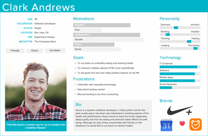
User personas are archetypical users whose goals and characteristics represent the needs of a larger group of users. Usually, a persona is presented in a one or two-page document (like the one you can see in the example below). Such 1–2-page descriptions include behavior patterns, goals, skills, attitudes, and background information, as well as the environment in which a persona operates. Designers usually create user persona template templates, which include a few fictional personal details to make the persona a realistic character (e.g. quotes of real users), as well as context-specific details (for example, for a banking app it makes sense to include a persona’s financial sophistication and major expenses).
 User persona template. Image by Xtensio.
2.1. Empathy Mapping
Empathy is a core value if designers want to make something that is good for the people who are going to use it. Personas help designers to create understanding and empathy with the end-users.
- Gain a perspective similar to the user. Creating user personas can help designers step out of themselves and recognize that different people have different needs and expectations. By thinking about the needs of a fictional persona, designers may be better able to infer what a real person might need.
- Identify with the user they are designing for. The more designers engage with the user personas and see them as real people, the more likely they will be to consider them during the design process and want to create the best product for them.

2.2. Storyboards
A storyboard is a comic strip used to capture a user’s interaction with a product or service. It allows researchers and stakeholders alike to visualize and brainstorm.
3. Wireframing
A wireframe is a visual guide to the framework of your product. It allows you to define the information architecture, navigation design, and interface design. The most important advantage of wireframing is that it provides an early version of the product for you to review with both your internal and external stakeholders. Adjustments can be made easily to the wireframes before moving on to the more complicated process of technical development.
4. Prototype
A prototype is version 1.0 of your website or product. It resembles the closet version of your final outcome. A prototype allows the UX researchers to examine and identify any flaws, errors, or inconsistencies in overall design and experience before it is converted to the actual version by the development team.
5. Testing
With prototypes, user testing can be conducted with users to validate the design flow and user experience.
5.1. Heuristic Evaluation
Heuristic evaluation is the experts’ reviews of a website’s usability according to a list of usability principles and common heuristics. While UX experts could never replace user testing, they can identify any discrepancies from the common heuristics. You can then eliminate these discrepancies before proceeding to user testing.
5.2. Usability Testing
In usability testing, participants are invited to perform a few guided tasks on the prototype and actual product. The settings are usually in the lab or in the form of contextual inquiry. Contextual inquiry is a semi-structured interview method to obtain information about the context of use. Users are observed and questioned while they work in their own environments to make them feel comfortable. Usability testing might be one of the most used UX methods. It is very effective in identifying potential usability or design issues and exploring the area of improvement in functionality.
5.3. A/B Testing and Multivariate Testing
A/B Testing is a method of comparing two versions of a website or product to determine which one has better performance. It is usually used to test new or experimental feature update before it is released.